me204-2025-project-srishtisahu
🎨 Art Perception Analysis
🧪 Project Overview
This project explores how three visual factors—brightness, size, and colourfulness—influence the number of people attracted to different paintings. Using a synthetic dataset collected from controlled observations, we examine patterns and anomalies in visual preferences using various plots and statistical visualizations.
🧠 Key Findings
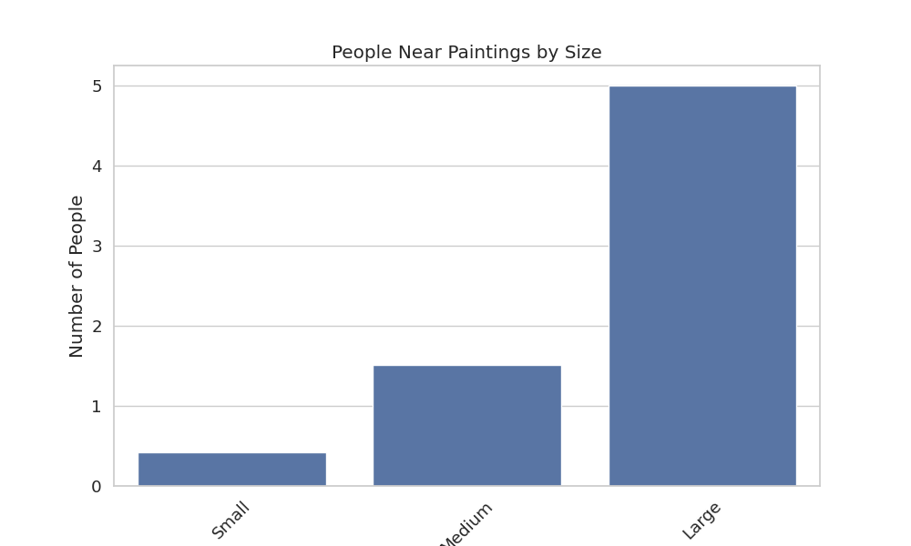
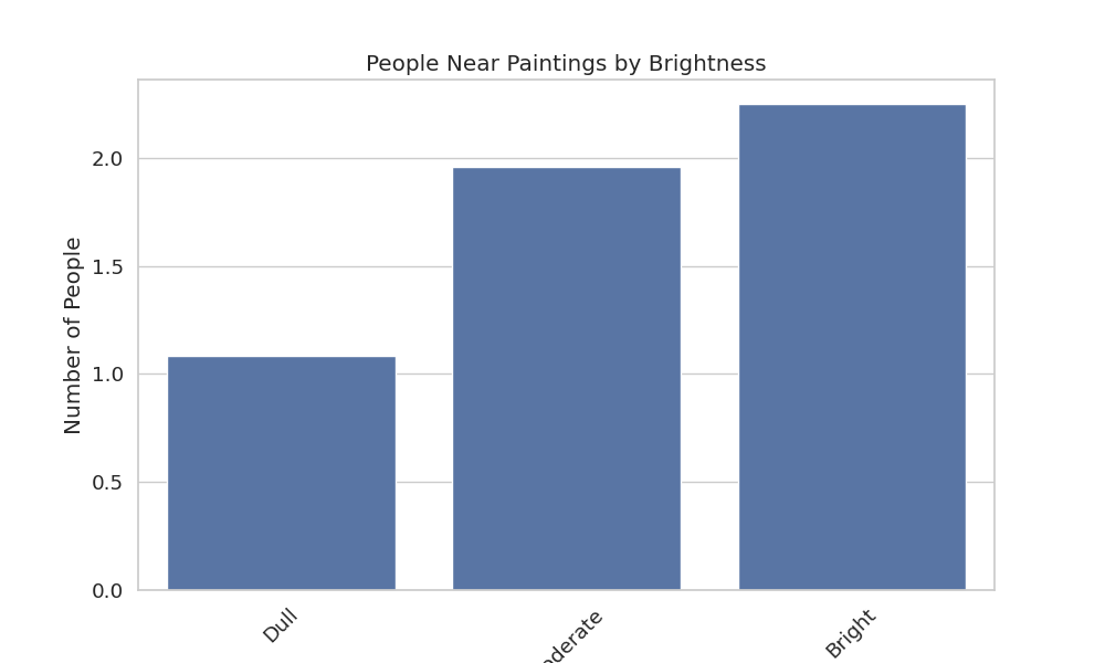
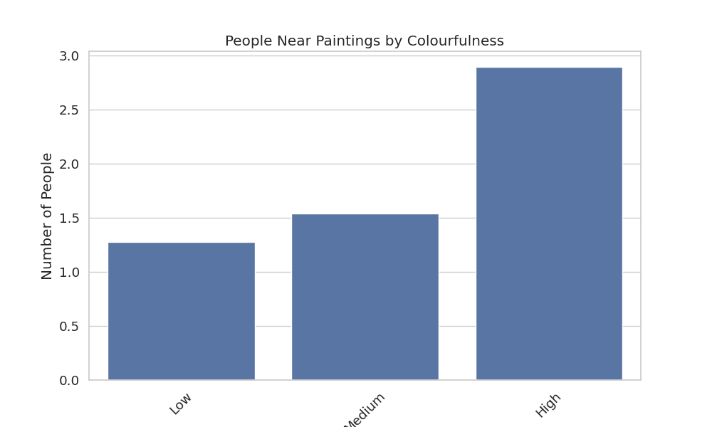
📈 When analysed individually, all three factors—brightness, size, and colourfulness—show an increasing pattern in the number of people attracted as the intensity increases.
🔥 According to the heatmaps, the most attention was drawn to:
-
Moderately bright + large sized paintings.
-
Low colourfulness + large sized paintings.
This is a bit unexpected, isn’t it?
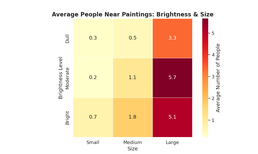
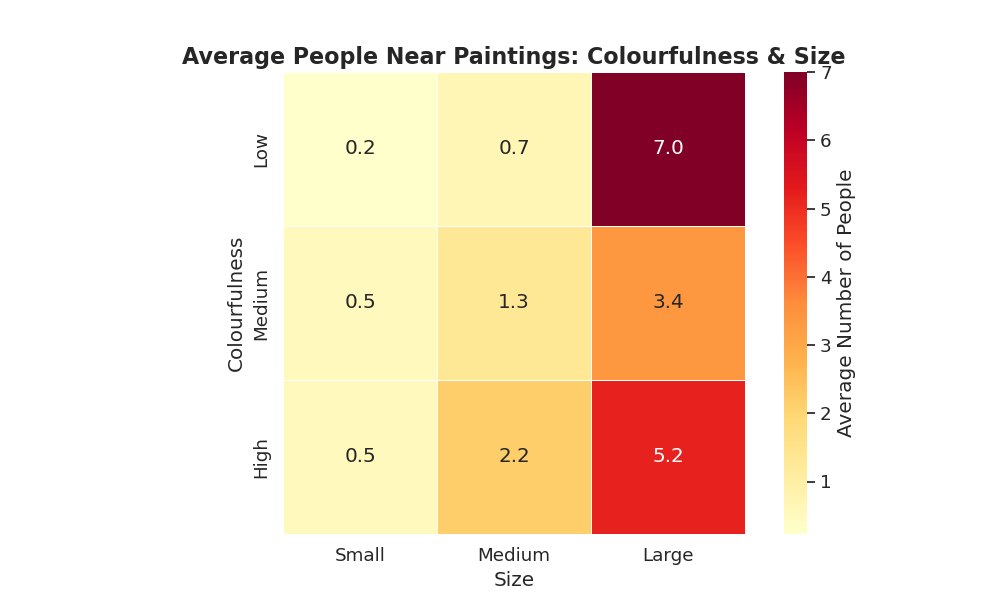
The reason behind this can be seen using box plots for brightness and colourfulness as it shows outliers:
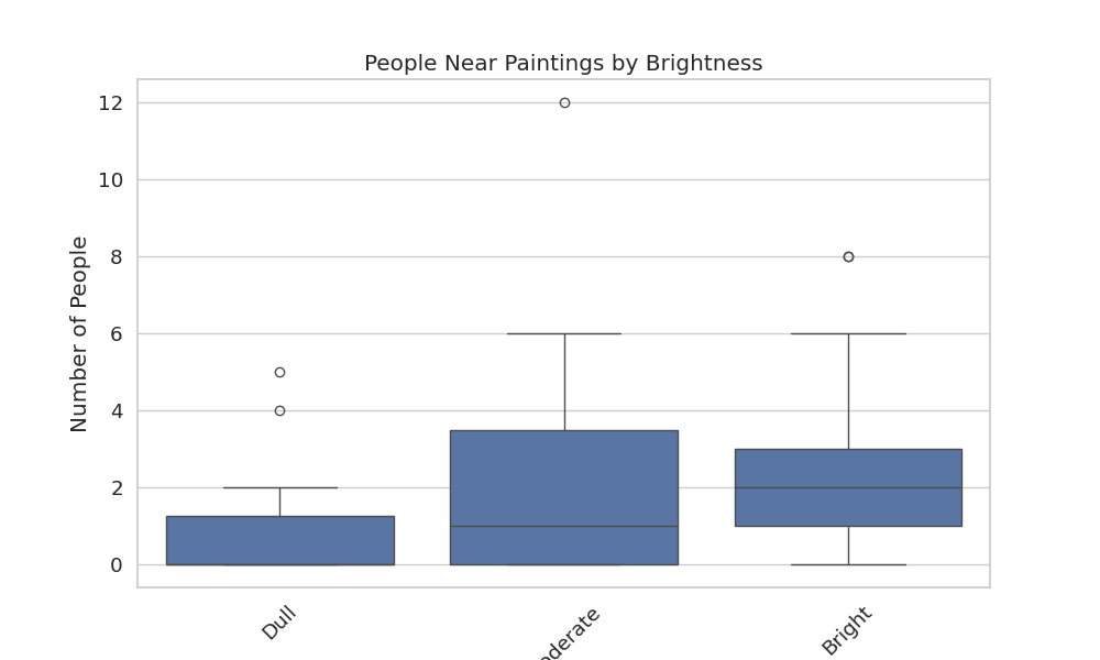
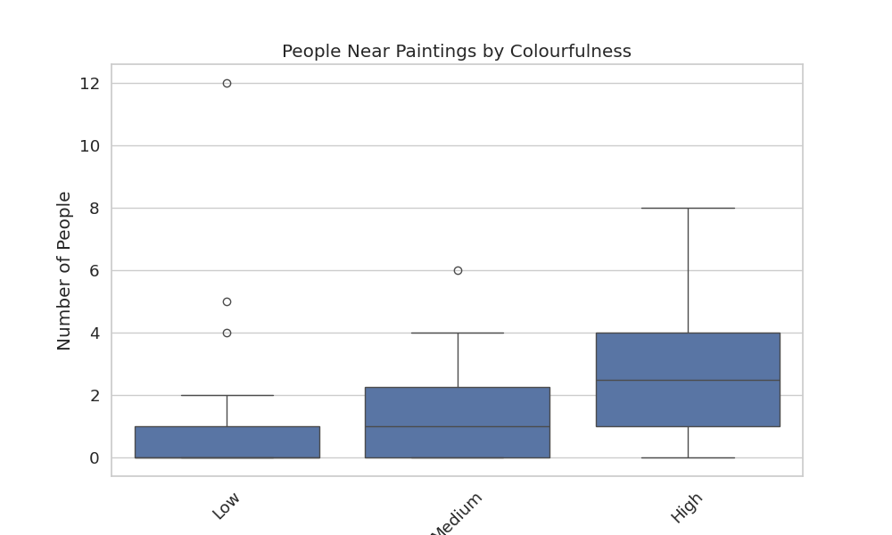
As seen, there are outliers in both the boxplots resulting in the strange results from the heatmaps!!
💡 Conclusions
- Size matters most—larger paintings consistently attracted more viewers.
- Brightness has a sweet spot—extremely bright or dim artworks were less appealing.
- Colourfulness isn’t always linear—sometimes low-colour paintings performed better, possibly due to minimalism or contrast.